- Aleph
- Anna Gat
- Ariel LeBeau
- Austin Robey
- David Blumenstein
- David Ehrlichman
- David Kerr
- Devon Moore
- Dexter Tortoriello
- Drew Coffman
- Drew Millard
- Eileen Isagon Skyers
- FWB Staff
- Gaby Goldberg
- Greg Bresnitz
- Greta Rainbow
- Ian Rogers
- Jessica Klein
- Jose Fernandez da Ponte
- Jose Mejia
- Kelani Nichole
- Kelsie Nabben
- Kevin Munger
- Khalila Douze
- Kinjal Shah
- Kyla Scanlon
- LUKSO
- Lindsay Howard
- Maelstrom
- Marc Moglen
- Marvin Lin
- Mary Carreon
- Matt Newberg
- Mike Pearl
- Mike Sunda (PUSH)
- Moyosore Briggs
- Nicole Froio
- Original Works
- Ruby Justice Thelot
- Ryne Saxe
- Simon Hudson
- Steph Alinsug
- The Blockchain Socialist
- Willa Köerner
- Yana Sosnovskaya
- Yancey Strickler
- iz

Thu Jul 28 2022
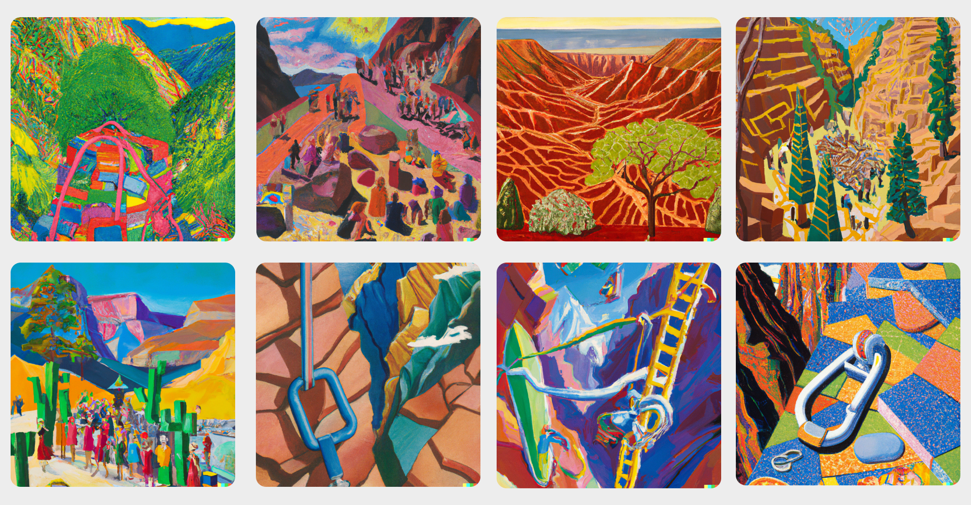
FWB FEST kicks off on August 12, when friends from across the corners of the internet will touch down in Idyllwild, CA for three days of music, conversation, and wholesome outdoor fun. But thanks to a colorful, DALL-E-driven visual identity by designers David Rudnick and Laiqa Mohid, along with some very talented collaborators from Rudnick’s Ghent, Belgium-based studio Terrain (Maharani Yasmine Putri and Emiel Penninckx), we’ve already been living the mindset.
After some heady, philosophical conversations about what it means to bring our online community together offline and a site visit to Idyllwild, the FEST identity was born. The collaborators drew from a wide array of references — from multi-colored hiking backpacks, to the vibrant Canyon paintings of David Hockney, to the strata patterns found in rock formations — to create a design system that looks and feels uniquely FWB. Along the way, the DAO’s own Dexter Tortoriello combined these gestural inputs with DALL-E image generation prompts, targeted at key signifiers and locations of FEST. FWB Head of Product Mike Bodge took the lead on technical implementation, building a custom website for the festival, a unique smart contract, and a set of unique generative NFTs to power the FEST experience.
In a conversation with FWB Head of Brand Lindsay Howard, Rudnick peeled back the curtain on the influences and ideas that inspired the group's work. His words, reproduced below, and have been edited for length and clarity. —Eileen Isagon Skyers and Emilie Friedlander
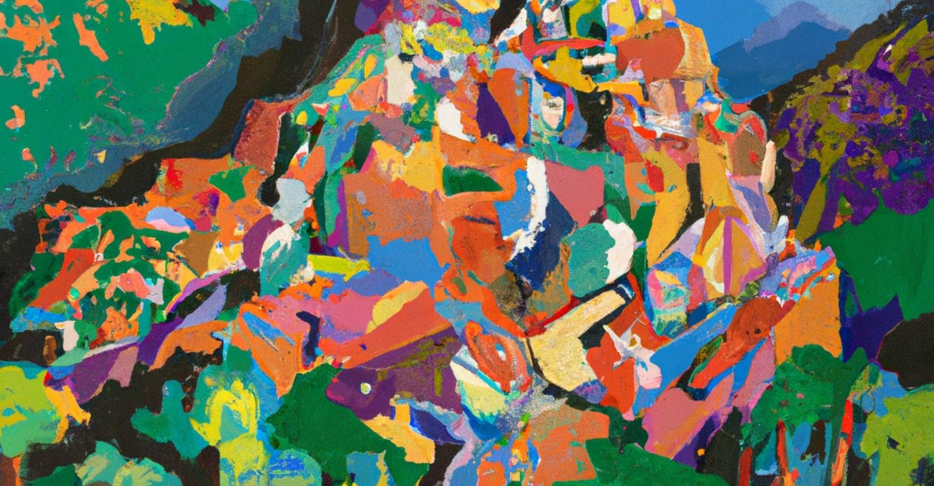
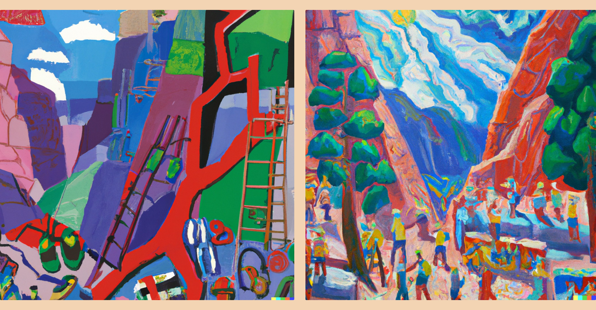
David Rudnick: FWB is a community at the forefront of new technology, but its strongest qualities are human. Working alongside Laiqa Mohid and the team at Terrain, we wanted to embrace the physicality, colors, and textures of the landscape where FEST will take place. A core visual reference was David Hockney’s Canyon paintings, which celebrate the incredible vibrancy, scale, pattern, and color of the California landscape. We wanted to show a fusion of this epic, ancient, and beautiful space and something completely of this moment and new and digital.
Terrain’s aim was to bring this system to life with imagery that moves beyond what is expected of the Web3 space, which often ends up reproducing the clichés of “metaverse” spaces that look like video game concept art or lobbies. FWB has always, in a beautiful way, felt like a community that is as interested in the built or discovered reality of spaces and environments as it is these ubiquitous digital hubs. That sense of vibrancy, possibility, texture, and nature — made real in part by digital means — felt right as a way of manifesting FEST’s language.
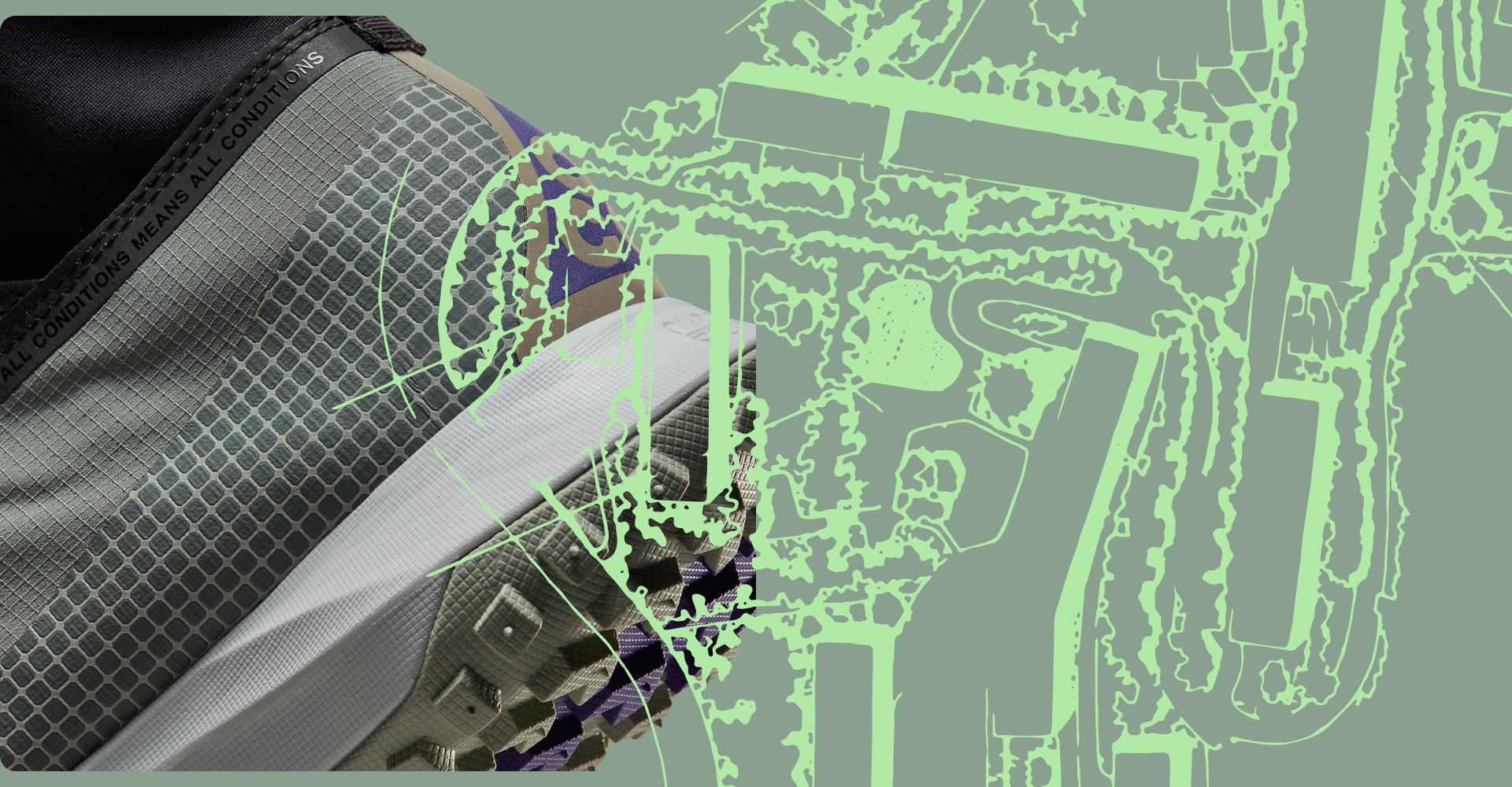
We wanted to arrive at a set of components that are novel in their combination, including a sense of the [virtual intersecting with the tangible, physical world]. It moves us away from the contemporary, toward a broader expanse of time. The idea is to experience a connection with the land, and also to bring people closer to each other. To reflect that feeling in the design, we started by looking at the visual language of outdoor equipment with high-tech, high-functional components — like carabiners and other hiking gear — and thought about how those could be applied to digital, community spaces that don’t look anything like anything else in Web3. It’s about capturing the human, interconnected spirit of FWB.
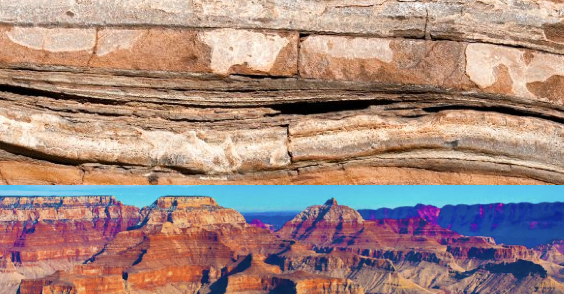
We wanted to create a system that was built for the natural environment while still embracing the high-tech, modular sophistication that would appeal to Web3 pioneers. The vibrant juxtapositions [in color, texture, and pattern] you see in the highly technical applications of the outdoor gear mirrored another aspect of the natural landscape that felt like a strong counterpoint and reference: the strata visible in layers of earth and rock, which speak to deep units of geological time. This felt like a nice [contrast] to the ephemerality or “faddiness” you might see in other Web3 visuals.
We took inspiration from the radical patchwork palettes of technical outerwear and used them as the basis for the grid, with a series of horizontal slices and a catalog of textures for populating and differentiating them that we call Strata. We looked at the bright identifying colors, as well as the demarcation of different components and textures and how each material reflects its own textual or sub-structural qualities. We paired perforated, beveled materials with photographs from our site visit at Idyllwild, which, together, felt like they reflected the natural California landscape. The beautiful, strata-like formations that resulted show difference and diversity, but within a coherent system.
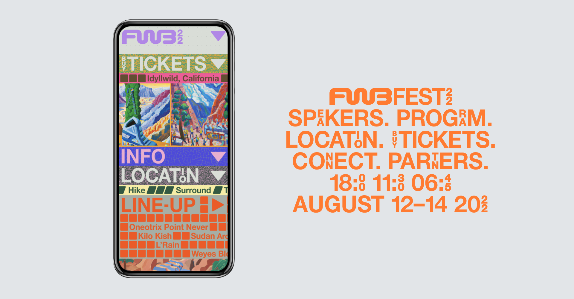
The idea of a vertically sliced stack also became really intriguing to us, because it speaks to how things accumulate over time, and lends itself to things like schedules, maps, and other event programming. Web3 can feel so ephemeral and non-physical, so we decided to pull in some unusual, unexpected signifiers, like [stacked blocks and reactive elements].The goal was to bring all of this to life, and translate it to a point where it’s not regressive or retrospective, but feels imaginative and transformative. We chose to take Hockney’s Canyon paintings as inspiration because they have a certain amount of optimism, and celebrate all of the world’s different colors and textures.
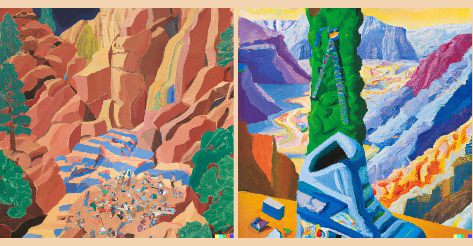
The outdoors are full of possibility — and we thought this would be a nice moment to merge that expansive feeling with something very contemporary and technical, using imagery formed through AI prompts in DALL-E. The software creates surprising options for building design systems, especially when you’re building an entire concept around an illustrative style. I think that DALL-E really complements the system and brings it to life in a unique way. The various components of the visual outputs from DALL-E illustrate how something might look complex at first glance, but there’s always logic and rules under the hood.
When we started exploring the system, there was so much vibrancy and vitality, and we wanted to have a utilitarian approach for populating it with content. The typeface we used is essentially a custom grotesk based on Matta — which itself is my personal redrawing of Helvetica — but populated with stacked ligatures that create these vibrant interruptions and unusual forms in the word shapes. All of the changes are ones we specifically built to make the font compatible with the larger design system.
The stacked ligatures help us cram in more content horizontally while keeping the size as big as possible, which was essential for allowing the bands of the layouts to be bold and engaging. Visually, they are another callback to those rock piles, or “strata.” With their cracks and tightly packed textures, they’re harmonizing with the ways the identity is about bringing in notions of the outside, rather than just digital space. The font has its own unique voice, even though proportionally, it’s basically the [version of] Helvetica that I always use in my designs. But it’s evolved. The whole thing strikes a good balance between utility and fun.


